
Leave Black Behind, Use Alternative Colors in Your Designs
Black is often preferred in designs as a symbol of elegance and seriousness. However, although black has distinct advantages, using alternative tones offers many benefits. In this article, we will discuss why you should consider different shades instead of black in your designs, the positive effects of this change, and suggest some alternative colors you can use instead of black.
Why Should We Avoid Using Black?
Softer and More Inviting Looks
Black is a strong and sharp color, but it can sometimes create a harsh and cold impression. Alternative tones, especially neutral and pastel colors, provide a softer and more inviting appearance. For example, light gray or beige tones can add warmth to a design and help users feel more comfortable.
Contrast and Readability
Black provides excellent contrast on white backgrounds. However, it can cause eye fatigue during long reading sessions. Softer alternatives like dark gray or navy blue can maintain similar contrast while reducing eye strain. This is particularly important for improving user experience in digital designs.
Modern and Innovative Appearance
Although black is a classic and time-tested color, using alternative tones can be more effective to achieve a modern and innovative look. For example, vibrant colors or sophisticated pastel shades can highlight that a brand or design is contemporary and forward-thinking. This is especially advantageous for brands targeting a young and dynamic audience.
Emotional Impact and Color Psychology
Colors can trigger emotional responses and influence how a brand is perceived. While black is often associated with power, mystery, and authority, different color tones can evoke different emotional reactions.
For example;
- Blue: Trust and loyalty
- Green: Nature and tranquility
- Red: Energy and passion
- Yellow: Happiness and optimism
Using these colors can create an emotional impact aligned with the design’s purpose and generate the desired effect on the target audience.
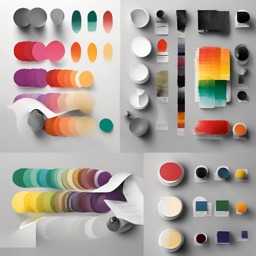
Alternative Colors You Can Use Instead of Black
In conclusion, while black remains a strong and elegant choice in designs, it is important not to overlook the advantages offered by alternative colors. From softer and more inviting looks to modern and innovative designs, you can enhance your design impact by using different color tones. Consider going beyond black to strengthen your brand identity, build emotional connections, and fulfill environmental responsibilities. This way, you can create designs that are both aesthetically rich and user-friendly.
For similar articles, check the Design category.
Follow our Instagram account to stay updated with posts and developments: yazilim.yap